Best Practices for CV Formatting in 2026
The best practices for CV formatting center on three non-negotiable principles: clear structure, ATS compatibility, and strategic placement of your strongest qualifications. Recruiters spend about 7.4 seconds scanning a resume before deciding whether to read further. That number means your name, title, and top achievements must be visible within the first glance. This guide covers every formatting decision you need to make, from font selection to section order, with specific recommendations backed by research from UC Davis Career Center, Jobscan, and NeuraCV’s 2026 design guide.
1. Best practices for CV formatting: start with the right font
Font choice is the first signal of professionalism a recruiter receives. Clean sans-serif typefaces like Arial, Calibri, Roboto, and Inter are the standard for modern CVs because they render clearly on screen and parse cleanly through applicant tracking systems (ATS).
Font sizing follows a clear hierarchy. UC Davis and Jobscan both recommend 10 to 12 pt for body text, 12 to 16 pt for section headings, and 14 to 20 pt for your name at the top. This hierarchy guides the reader’s eye without requiring decorative elements. Stick to one font family throughout the document. Mixing typefaces, even subtly, creates visual noise that slows scanning.

Color deserves restraint. NeuraCV’s 2026 design guide recommends one muted accent color used sparingly for headings or dividers. Think navy, slate, or charcoal rather than bright red or orange. Excessive color reduces accessibility for readers with visual impairments and can confuse ATS parsers that are not designed to interpret styled text.
Pro Tip: Test your CV by converting it to plain text. If the content reads logically and the hierarchy is still clear without any formatting, your font and structure choices are solid.
2. How white space and margins affect readability
White space is not wasted space. Adequate margins and spacing between sections give recruiters visual breathing room, which directly affects how much of your CV they actually read.
Standard margins run between 0.5 and 1 inch on all sides. Going narrower than 0.5 inches to fit more content is a common mistake. It makes the document feel cramped and signals poor judgment about presentation. Line spacing of 1.0 to 1.15 within sections and a clear break between sections keeps the layout open without inflating page length unnecessarily.
Consistent spacing also matters for ATS parsing. Systems that extract text from PDFs rely on predictable spacing patterns to identify where one section ends and another begins. Irregular spacing can cause a skills section to be read as part of your work history, which corrupts the data a recruiter sees in their applicant tracking dashboard.
3. Choosing between single-column, two-column, and hybrid layouts
Layout structure is where many job seekers make their biggest formatting error. The three main options each carry distinct trade-offs.
A single-column layout is the safest choice for ATS compatibility. UC Davis and Indeed recommend avoiding tables, graphics, and multi-column designs because they cause parsing errors in most ATS platforms. Single-column formats read left to right, top to bottom, which is exactly how ATS software processes text. For roles at large companies that use platforms like Workday, Greenhouse, or Lever, single-column is the default recommendation.
Two-column layouts look polished in a PDF sent directly to a hiring manager, but they carry real risk. Many ATS systems read columns left to right across the full page width rather than column by column. This scrambles your content into an unreadable sequence. If you use a two-column design, reserve it for direct applications where you know a human will open the file first.
Hybrid formats blend a narrow sidebar for contact details and skills with a full-width main column for experience. This approach works well for career changers who want to highlight transferable skills prominently without burying work history. The table below summarizes the key differences.
| Layout | ATS compatibility | Best for | Main risk |
|---|---|---|---|
| Single-column | High | Most applications | Can look plain without strong typography |
| Two-column | Low to medium | Direct recruiter submissions | Parsing errors in ATS platforms |
| Hybrid | Medium | Career changers, skill-heavy roles | Sidebar content may be misread by ATS |
4. Organizing sections for maximum impact
Section order is a strategic decision, not a default setting. The standard sequence for most candidates is: contact information, professional summary, work experience, education, and skills. This order works because it front-loads the information recruiters care most about.
Reverse chronological order is the default for work experience and education. Most recent roles appear first because they are most relevant to current hiring decisions. Use past tense for completed roles and present tense for your current position. Inconsistent verb tense is one of the most common errors that signals carelessness to a recruiter reading carefully.
For recent graduates and career changers, the rules shift. Moving education and relevant projects ahead of work history can better showcase transferable qualifications when your degree or a portfolio project is more relevant than your job titles. A computer science graduate applying for a software engineering role should lead with their degree and GitHub projects, not a part-time retail job.
Here are the key section ordering principles to follow:
- Place contact information at the very top, including your LinkedIn profile URL and portfolio link if relevant
- Write a professional summary of two to three sentences that names your specialty, years of experience, and one measurable result
- List work experience in reverse chronological order with three to five bullet points per role
- Keep each bullet to one or two lines and front-load quantified achievements at the start of each point
- Place education after experience for candidates with more than two years of work history
- Add a skills section that mirrors language from the job description to support ATS keyword matching
Pro Tip: Read the job description carefully and match the section headings on your CV to the language the employer uses. If they say “Core Competencies,” use that phrase instead of “Skills.”
5. Optimizing your CV for ATS software
ATS software screens most applications before a human ever sees them. Formatting choices that look fine in a PDF can completely break how an ATS reads your content. Understanding the specific errors that cause rejection is the most practical thing you can do before submitting any application.
Functional CV formats are not recommended for ATS in 2026. Recruiters also view them skeptically because they are associated with hiding employment gaps. Stick to reverse chronological or hybrid formats. Beyond structure, the following formatting elements cause the most ATS parsing failures:
- Tables and text boxes: ATS systems often skip content inside these elements entirely
- Graphics, icons, and logos: these are invisible to text parsers and waste space that could hold keywords
- Headers and footers: contact information placed in a document header may not be extracted correctly
- Non-standard section headings: labels like “Where I’ve Been” instead of “Work Experience” confuse ATS categorization
- Inconsistent date formats: mixing “Jan 2023” with “01/2023” creates parsing ambiguity
Use keywords from the job description naturally within your bullet points and summary. Tools like Jobscan compare your CV text against a job posting and show you which keywords are missing. This is not about stuffing terms into your document. It is about using the same professional vocabulary the employer uses. You can also learn more about keyword matching strategy to strengthen your ATS performance before submitting.
Pro Tip: Export your CV as a plain text file and read through it. If sections appear out of order or content is missing, your formatted version will likely fail ATS parsing.
6. CV length: one page vs. two pages
Length is one of the most debated formatting questions, and the answer depends entirely on your career stage. UC Davis Career Center states that recent graduates should keep CVs to one page, while candidates with extensive work history can justify two pages. This is a practical rule, not an arbitrary one.
A one-page CV forces you to prioritize. Every line must earn its place. For a new graduate, a two-page CV filled with coursework descriptions and club memberships signals an inability to edit, which is itself a professional skill. For a senior professional with 15 years of experience, a one-page CV signals that you have left out important context.
The rule for career changers sits in the middle. If you are moving from teaching to instructional design, your relevant transferable experience may fit on one page even if your full career history spans 10 years. Cut roles that do not support the narrative of your application. A tightly edited one-page CV for a career change is more persuasive than a two-page document that buries the relevant experience.
7. Proofreading and final quality checks
A CV with a typo in the first section is rejected at a rate that no amount of good formatting can recover from. Proofreading goes beyond running spellcheck. UC Davis and Indeed advise thorough proofreading and testing your export to confirm ATS-friendly formatting survives the conversion.
Read your CV out loud. This catches awkward phrasing and missing words that your eyes skip over when reading silently. Then ask someone else to read it. A second reader catches errors you have become blind to after multiple revisions. Tools like Grammarly and ProWritingAid catch grammar and consistency issues that spellcheck misses, including inconsistent capitalization of job titles and tense shifts between bullet points.
Check the formatted PDF on both a desktop screen and a mobile device. Recruiters increasingly review applications on phones, and a layout that looks clean at full size can become unreadable at mobile scale. If your CV needs deeper optimization beyond proofreading, reviewing your overall structure against current recruiter expectations is a worthwhile step before your next application round.
Key takeaways
Effective CV formatting requires ATS-compatible structure, consistent typography, strategic section order, and clean proofreading to pass both automated screening and recruiter review.
| Point | Details |
|---|---|
| Font and sizing | Use Arial, Calibri, or Roboto at 10 to 12 pt body, with a clear size hierarchy for name and headings. |
| Layout choice | Single-column formats offer the highest ATS compatibility for most job applications. |
| Section order | Reverse chronological is the default; graduates and career changers should lead with education and projects. |
| ATS optimization | Avoid tables, text boxes, graphics, and non-standard headings that break ATS parsing. |
| Length rule | One page for recent graduates; two pages only when extensive experience genuinely requires it. |
What I’ve learned about CV formatting after reviewing hundreds of applications
Most job seekers treat CV formatting as a cosmetic task. They pick a template that looks good, fill in their details, and submit. That approach explains why so many well-qualified candidates never hear back.
The formatting decisions that actually matter are structural, not visual. I have seen candidates with impressive careers get filtered out because their two-column layout scrambled their work history inside an ATS. I have seen recent graduates land interviews at competitive firms because they placed a strong quantified project at the top of a clean single-column document. The content was good in both cases. The formatting made the difference.
The most persistent mistake I observe is treating the CV as a record of everything you have done rather than a targeted argument for why you are the right person for one specific role. Clarity and tailoring are not optional refinements. They are the core of what makes a CV work. There is no single perfect format, but clarity and consistent formatting tailored to each position reliably improve outcomes across every career stage.
My honest recommendation for 2026: use a clean ATS-friendly template, write a two-sentence summary that names a measurable result, and cut every bullet point that does not directly support your application for that specific role. The candidates who get interviews are not the ones with the most experience. They are the ones who make their relevant experience the easiest to find.
— Andras
Build a recruiter-ready CV with Easy-cv
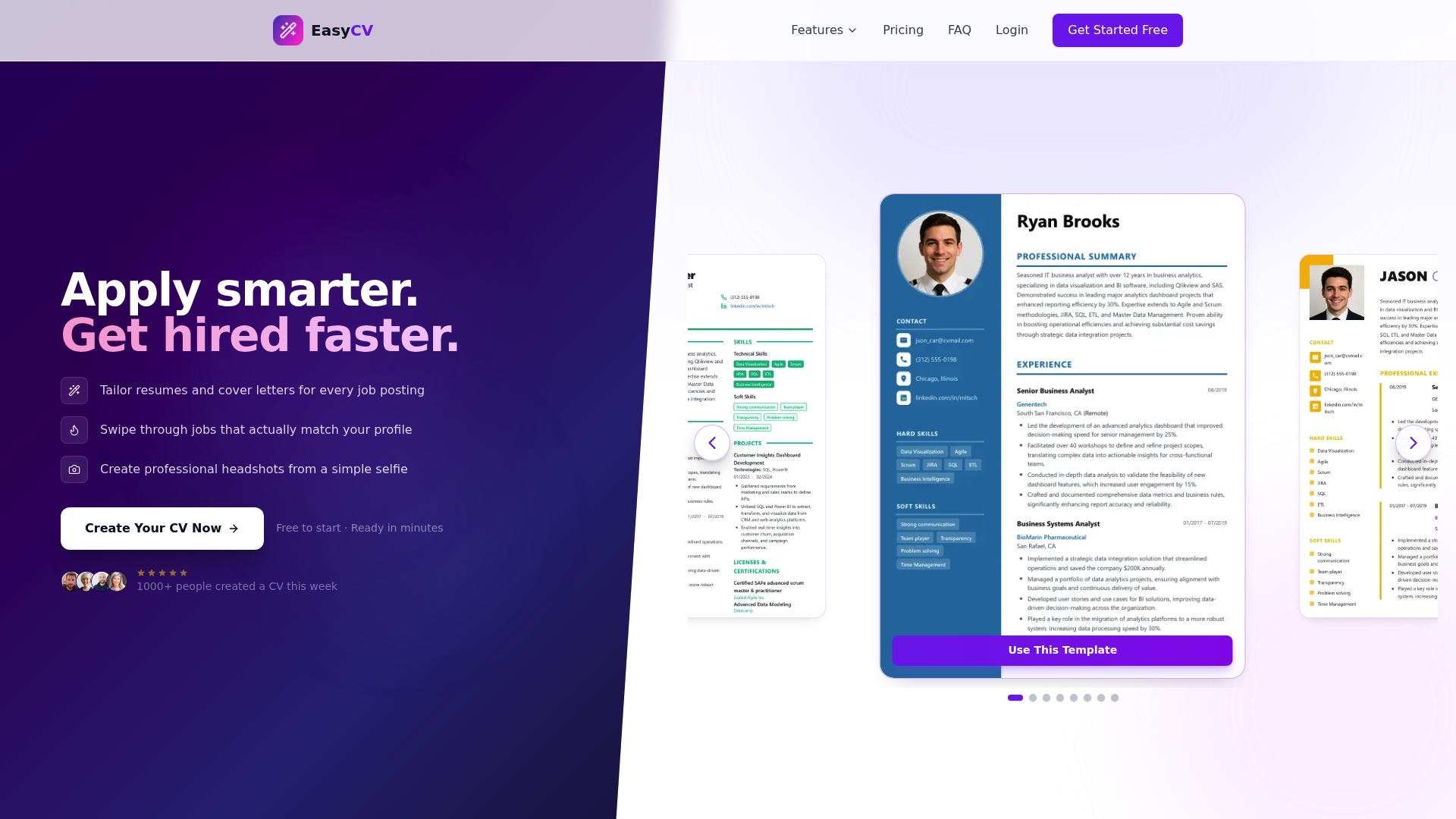
Easy-cv puts every tool you need to apply these formatting principles into one place. The AI-powered CV builder offers a wide selection of ATS-compatible templates with clean typography, adjustable layouts, and built-in keyword guidance that mirrors the language of each job posting. You can tailor your CV and cover letter for every application without starting from scratch each time. The AI writing assistant refines your bullet points and professional summary to front-load your strongest achievements. Whether you are a recent graduate building your first CV or a career changer repositioning your experience, Easy-cv handles the formatting mechanics so you can focus on the content that wins interviews. Explore the full feature set here to see how it fits your job search.
FAQ
What font is best for a CV in 2026?
Arial, Calibri, Roboto, and Inter are the top choices because they are clean, screen-readable, and parse correctly through ATS software. Use a consistent font family throughout and set body text between 10 and 12 pt.
Should my CV be one page or two pages?
Recent graduates should keep CVs to one page; candidates with extensive work history can use two pages. The deciding factor is whether the additional content directly supports your application for the specific role.
What CV format works best with ATS software?
A single-column, text-based layout with standard section headings like “Work Experience” and “Education” gives the highest ATS compatibility. Avoid tables, graphics, text boxes, and multi-column designs that cause parsing errors.
How do I know if my CV will pass ATS screening?
Export your CV as a plain text file and check whether the content reads in the correct order without missing sections. Tools like Jobscan also compare your CV against a specific job posting to identify missing keywords.
Where should I put education on my CV?
Place education after work experience if you have more than two years of professional history. Recent graduates and career changers should move education and relevant projects above work history when those credentials are more relevant to the target role.