What Is Resume Formatting and Why It Matters
Most job seekers spend hours perfecting their resume’s content and almost no time thinking about how it looks on the page. That’s a costly mistake. What is resume formatting? It’s the system of visual and structural decisions that controls how your information is organized, displayed, and read. And it matters more than most people realize. The right format gets your resume past automated screening systems and into the hands of a real recruiter. The wrong one gets you filtered out before anyone reads a single word you wrote.
Table of Contents
- Key Takeaways
- What is resume formatting: definition and core principles
- The three main resume formats
- ATS-friendly formatting practices for 2026
- Common formatting mistakes and how to fix them
- Applying resume formatting effectively
- My honest take on resume formatting
- Format your resume in minutes with Easy CV
- FAQ
Key Takeaways
| Point | Details |
|---|---|
| Formatting affects ATS success | Poor layout choices cause automated systems to misread or discard your resume entirely. |
| Three main formats exist | Chronological, functional, and combination formats each suit different career situations. |
| Simple design outperforms fancy | Conservative, clean formatting beats creative layouts for most industries and roles. |
| Contact info placement matters | Keep contact details in the resume body, not in headers, so ATS systems can read them. |
| Proofreading is part of formatting | Even one typo can cost you the interview regardless of how well everything else is structured. |
What is resume formatting: definition and core principles
Resume formatting is the deliberate organization of your resume’s visual and structural elements to make your qualifications easy to read, easy to scan, and compatible with the software that processes job applications.
It’s not the same as resume content. Content is what you say. Formatting is how you present it. The two work together, but they’re separate decisions. A candidate with strong content and weak formatting often loses to a candidate with average content and polished presentation. That’s the reality of modern hiring.
The main formatting elements you need to control are:
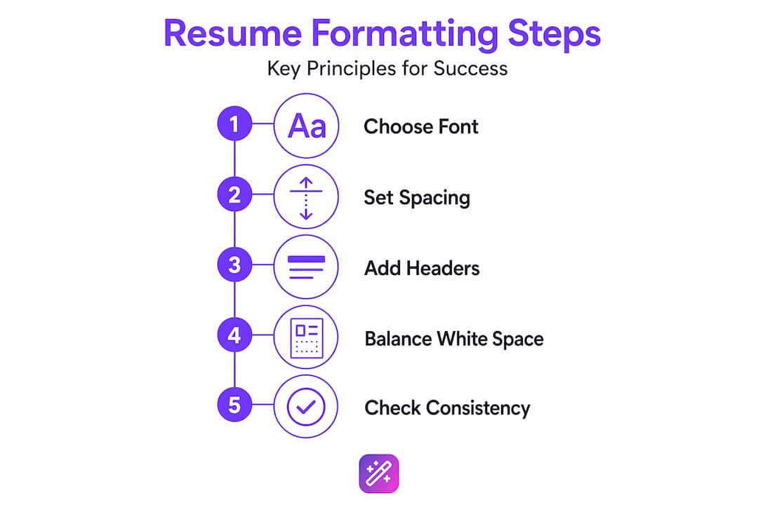
- Font choice and size. Stick to professional, readable fonts like Calibri, Georgia, or Arial. Body text should sit between 10.5 and 12 points. Section headers can go up to 14 points.
- Margins. One inch on all sides is the standard. You can go as low as 0.5 inches if space is tight, but anything narrower looks crowded.
- Spacing. Consistent line spacing between sections and bullet points helps recruiters scan quickly. Single spacing within sections and a small gap between them works well.
- Alignment. Left-align all body text. Centered text looks stylish but reads slowly.
- Section order. Put your most relevant information first. For most candidates, that means contact info, a summary, work experience, and then education and skills.
- Consistency. Every date, every bullet, every heading should follow the same pattern throughout the document.
One-font, consistent spacing with clear headers and balanced white space produces better recruiter scanning efficiency than complicated designs. That finding should free you from the pressure to make your resume look like a graphic design portfolio.
Pro Tip: Before you change anything else on your resume, run a consistency check. Pick one date format, one bullet style, and one heading size, then apply them everywhere. That single pass often makes a resume look 30% more professional without touching a word of content.
The three main resume formats
Understanding resume structure means knowing that the same information can be arranged in fundamentally different ways depending on your career situation. Three formats dominate the job market, and each has its own formatting logic.
| Format | Best for | Layout focus | What it emphasizes |
|---|---|---|---|
| Chronological | Most job seekers with steady experience | Reverse-order work history at the top | Career progression over time |
| Functional | Career changers or those with gaps | Skills and abilities grouped by theme | What you can do, not when |
| Combination | Experienced candidates changing fields | Skills summary followed by work history | Both capabilities and track record |
The chronological format is the default for a reason. Recruiters know exactly where to look for dates, job titles, and company names. It flows naturally and reads quickly. If your work history is consistent and relevant, this format is almost always your best resume format choice.

The functional format reorganizes everything around skill categories instead of employers. A section called “Project Management” might pull examples from three different jobs without specifying exactly when. This helps people re-entering the workforce or pivoting to a new industry. The downside is that some recruiters distrust it because it obscures the timeline.
The combination format opens with a strong skills or summary block, then follows with a standard reverse-chronological work history. It’s ideal when you have substantial experience but are moving into a new role or industry where you need to lead with transferable skills. For a deeper look at how these three differ in practice, the types of resume formats guide from Easy CV breaks down how to pick the right one based on your specific situation.
ATS-friendly formatting practices for 2026
This is where formatting decisions become make-or-break. Most companies with more than 50 employees route applications through an Applicant Tracking System before a human ever sees them. These systems parse your resume into data fields. If your formatting confuses the parser, your qualifications disappear.
ATS parsing fails on resumes that use tables, text boxes, or multiple columns, causing important information like your name and experience to be lost or misplaced. This is one of the most common and fixable mistakes candidates make.
Here’s what ATS-friendly formatting actually looks like in practice:
- Use a single-column layout. Two columns look clean to a human eye, but ATS software often reads them left to right across both columns simultaneously, producing garbled nonsense.
- Avoid graphics and icons. Skills meters, progress bars, and decorative icons are invisible to parsers. They waste space and confuse the system.
- Use standard section headings. Write “Work Experience” not “Where I’ve Been.” Write “Skills” not “My Toolkit.” ATS systems are trained to find specific labels.
- Keep contact info in the body. Contact information in headers is often missed entirely by ATS software. Place your name, phone number, email, and LinkedIn URL in the first few lines of the document itself.
- Export as PDF, but check the job posting. Some older ATS systems still prefer Word documents. When in doubt, submit what the employer requests.
“The best-formatted resume is one that a software system can read perfectly and a human can scan in six seconds.” That’s the dual standard every job seeker should format toward.
Beyond layout, matching keywords from the job description with exact phrasing in your resume improves your ATS ranking significantly. If the posting says “cross-functional collaboration,” your resume should use that phrase, not a paraphrase of it.
For advanced users, tools like Typst and LaTeX produce clean, parseable PDFs without the formatting drift that commonly occurs when Word documents are opened on different operating systems. These tools create stable, ATS-optimized files that look exactly the same every time.
Pro Tip: After you finish formatting, copy and paste your entire resume into a plain text editor like Notepad. If the content is readable and logically ordered in plain text, your formatting will survive almost any ATS parser.
Common formatting mistakes and how to fix them
Even experienced candidates make these errors. The good news is that every one of them has a straightforward fix.
-
Inconsistent date formats. Mixing “January 2022” with “01/2022” and “Jan '22” across the same document signals carelessness. Pick one format and use it everywhere. The most readable choice is “Month Year” written out: “March 2023.”
-
Too many fonts or colors. Using three different fonts and two accent colors to create visual variety backfires. It looks chaotic and unprofessional. Limit yourself to one font family, use bold for emphasis, and keep color to a single neutral accent if you use any at all.
-
Graphics, charts, and logos. A bar chart showing your “Excel proficiency at 85%” tells recruiters nothing meaningful and confuses ATS systems. Replace visual skill meters with a clean bulleted list of tools and technologies.
-
Crowded text with no breathing room. Shrinking margins and line spacing to fit everything on one page creates a wall of text no recruiter wants to read. If content doesn’t fit cleanly, cut it or extend to a second page. Two-page resumes show a 2.3x higher selection rate for candidates with five or more years of experience compared to one-page resumes.
-
Spelling mistakes left uncaught. Hiring managers discard resumes with even subtle typographical errors, regardless of qualifications. Reading aloud is one of the most effective ways to catch errors that silent reading and spell check miss.
-
Sending the wrong file version. Always rename your file clearly before sending. “Resume_JaneDoe_Marketing.pdf” beats “Resume_final_v3_ACTUAL.pdf” every time. Employers notice.
Applying resume formatting effectively
Knowing the rules is one thing. Applying them consistently across multiple job applications is where most people struggle. Here’s a practical system that works.
Start with a clean, professionally designed template. A template with proven formatting handles the hard decisions for you: margins, font pairing, spacing, and section order are already solved. What you customize is the content. Easy CV’s professional resume templates are built to be both visually sharp and ATS-compatible, which means you don’t have to choose between looking good and getting parsed correctly.
Tailor your formatting choices to the role. A resume for a software engineering position benefits from a clean, minimal layout. A resume for a marketing director role can support a touch more visual personality while still staying ATS-safe. Creative fields like graphic design or branding are the rare exception where a more designed resume can actually work in your favor.
Use cloud-based editors so your resume stays accessible and consistently formatted across devices. Formatting that shifts when opened on a different computer has ended more than a few candidacies. Save a master version and create tailored copies for each application.
Before you hit send, run through this quick checklist:
- One font family used throughout
- Consistent date format on every entry
- Standard section headings: Work Experience, Skills, Education
- Contact info in the body of the document, not in a header
- No tables, text boxes, or columns
- File saved as PDF with a clear, professional filename
- Proofread aloud at least once
Pro Tip: Keep a running “formatting master” document where you store your approved font, point sizes, spacing values, and date format. Copy these settings into every new version of your resume instead of re-deciding each time. Consistency across applications looks more professional and saves you real time.
For a thorough breakdown of how CV formatting guidelines apply across different professional industries, Easy CV’s resource library offers tailored advice beyond general best practices.
My honest take on resume formatting
I’ve reviewed hundreds of resumes over the years, and the pattern that surprises most people is this: the ones that get callbacks are almost never the most visually impressive. They’re the cleanest. The ones where everything is exactly where you expect it to be, the font never changes, and the dates all match.
The candidates who spend hours designing custom layouts with color gradients and two-column skill charts often get filtered out before a recruiter even opens the file. Meanwhile, someone with a simple, well-organized one-page document in Calibri 11 with proper white space gets the phone call. That contrast teaches you something important.
Formatting doesn’t need to impress. It needs to disappear. When your formatting is doing its job, the reader isn’t thinking about how the resume looks. They’re thinking about whether your experience fits the role. The moment the reader notices the formatting, something has gone wrong.
My strongest advice is to update your resume every three months, even when you’re not actively searching. Formatting decisions that felt fine six months ago often look dated or inconsistent when you revisit them. Regular maintenance means you’re never scrambling to fix a poorly formatted document the night before a deadline.
If you’re genuinely unsure whether your formatting is working, use tools that give you feedback. Test your resume through a plain text paste. Send it to someone on a different device and ask how it renders. Small investments in checking your formatting pay off in ways that rewriting your summary paragraph rarely does.
— Andras
Format your resume in minutes with Easy CV
Getting your formatting right shouldn’t take a weekend of frustration.
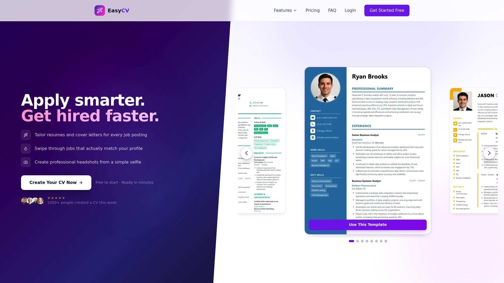
Easy CV’s AI-powered resume builder handles the formatting decisions automatically, so you can focus entirely on your content. Every template in the platform is built to pass ATS systems and look sharp to recruiters, with no manual fiddling required. The AI writing assistant refines your bullet points and adjusts language to match job descriptions, which strengthens your keyword alignment without extra effort. You can export polished, properly formatted PDFs in seconds, and with cloud access, your resume stays consistent whether you’re applying from your laptop or your phone. If you want even more control, Easy CV’s advanced formatting features let you customize every element while keeping the ATS-safe structure intact.
FAQ
What is resume formatting exactly?
Resume formatting is the set of visual and structural decisions that control how your resume looks and reads, including font, spacing, margins, section order, and layout. It determines both how easy your resume is for humans to scan and whether ATS software can parse it correctly.
What is the best resume format for most job seekers?
The chronological format works best for most job seekers because it presents work history in a clear, familiar order that recruiters expect. Candidates with gaps or career changes may benefit from a functional or combination format instead.
Does resume formatting really affect ATS results?
Yes. ATS systems fail to parse resumes that use tables, columns, or text boxes, which means qualified candidates get filtered out before any human review.
Should my resume be one page or two?
Length depends on experience. Two-page resumes produce significantly higher interview rates for candidates with five or more years of experience, while one page is generally better for early-career applicants.
Where should I put contact information on my resume?
Place your contact information in the main body of the document, not in the header. ATS systems often skip headers, which means your name and email may never get captured if they’re placed there.